Contact Information
274 Marconi Boulevard, Suite 400Columbus Ohio 43215
Estados Unidos
Social:
Basic Info
Empregados: 30
Empregados: 30
BillboardsIn.com
274 Marconi Boulevard, Suite 400Columbus Ohio 43215
Estados Unidos
Effective Billboard Design Examples
Designing a high-quality billboard that connects with your target audience can be a difficult challenge. With an endless amount of font combinations, images, and color palettes to choose from, you have to be strategic about selecting the right combinations that suit your business and brand.
Making a design that is relevant to your audience is key, as it will inform your approach and design choices. For example, a billboard for a corporation may utilize formal language and blue, grey, or black colors to convey professionalism. Below are a few examples of effective ads that our clients have run.

This is a great example of an appealing and effective design. Firstly, the font, color choice, and visuals express professionalism and trustworthiness. The slogan “Manage Your Pain Today” gives the reader a succinct and direct message that they can easily digest, and correlates to the brand.
In addition, there are fewer elements on the billboard, preventing it from being too distracting to the eye. The two primary colors blue and black establish a calm and bold presence, and the two professional profile photos of the doctors running the clinics convey openness and familiarity which helps increases feelings of trustworthiness for customers. This design provides excellent inspiration for billboards using corporate design norms in industries such as healthcare, insurance, and business.
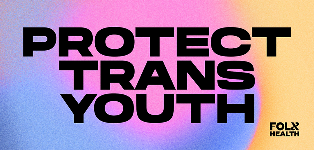
The Folx Health billboard is another great example of a billboard that caters to its audience with a relevant design. The “Protect Trans Youth” text in big bold letters delivers its message strongly and confidently. It shows support and urges viewers to take social action for the transgender community. The design is on track with current trends with its san serif bold font and use of a colorful gradient. This stylish design paired with its powerful message delivers a strong social impact billboard that is sure to garner attention. If you are an organization dedicated to social justice or a non-profit, this design can serve as a great blueprint for how you might communicate an important message in a striking and contemporary manner.
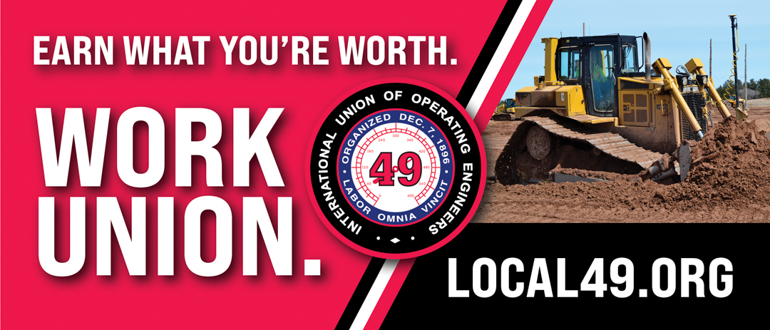
Last but not least, the International Union of Operating Engineers billboard provides a stellar sample that will be sure to turn heads and generate interest with its impressive message and design. The message gets straight to the point by stating “Earn What You’re Worth,” letting readers know the financial benefits of working in a union. The second part of the message urging readers to “Work Union” leaves an impressionable statement and sums up the main message of the billboard cleverly. The slanted line dividing each part of the billboard in half allows readers to take in information easily. Moreover, the high-resolution image of the tractor gives the billboard a professional and polished appearance. One of the most effective aspects of the billboard is its limited color palette. The red, black, and white colors work together to create a sense of unity and provide a distinct color contrast that stands out to the viewer.
Ready to start creating your own effective billboard designs for your business? Create a campaign on BillboardsIn today, and we’ll help you find the perfect location and even help you design your ad!
You can also find us on Facebook, Instagram, or LinkedIn for more information.